How do you know whether you’ve predicted an outcome correctly? In some cases – for example, a political race – the answer is straightforward. Either the outcome happened or it didn’t. In others, the answer is less straightforward. Often this happens because you can’t observe all of the data that you’d need in order to get a definitive answer.
I currently work as a product manager for a tech organization, and in that capacity I ask myself this kind of question a lot. Were users interested in a new feature? Did adding a new menu option make it easier for users to interact with the product? Did our new search design increase the click-through rate? To answer these questions, we often turn to analytics tracking: for example, we look at how many users interacted with a new feature to estimate how valuable it is. But, these questions don’t have straightforward yes-or-no questions – how many users have to interact with the feature in order for us to say, “yes, users were interested in it?” So instead, we try to pre-register a target to delineate between various levels of “success” – for example, if 50% of the users who saw the new feature went on to use it, that might be a strong indication that the feature was interesting and valuable. Then we ask more complicated questions: Did adding a new menu option make it as easy for users to interact with the product as I hoped it would? Do users seem as interested in a new feature as I expected? Does our new search design increase the click-through rate enough to count as “successful”?
This approach works well in theory, but an incontrovertible fact of life in this business is that the data are always incomplete. We want to move quickly, so we might count how many users engage with a feature in a 2-week period, rather than a year. That limits the amount of data we can collect, and increases the risk that we captured data from a set of users whose preferences don’t represent the whole user population. Maybe the rest of the users are more – or less – interested in a feature than the users in our data are. But we don’t know how the users that we don’t see would behave, so we have to bear that uncertainty. So, even when we know that 50% of the users who saw a feature during our test period also interacted with it, we know that to be a noisy measurement. There are no straightforward outcomes. Instead of an election – which has a clear outcome based on a finite number of votes – the situation is more like an opinion poll – which gathers data from a subset of the population in order to predict what everyone else thinks.
To grapple with this uncertainty, I built a probability calculator. This calculator helps answer the question, “If x / y users did something, how confident can I be that >=z% of users will do that thing?” For example, “if 10/100 users clicked a button to launch a new kind of analysis, how confident can I be that >=10% of users will launch that kind of analysis, going forward?”
The calculator is just a Python notebook (you can download it at this Github repo). In the notebook’s first cell, you define a few variables. The first set of variables creates a prior. The calculator works using a Bayesian method, setting up a prior distribution of the probability that different proportions of users are actually interested in the feature. This prior distribution has a “prior probability” (your hypothesis about the true probability that a user will interact with the feature) and a strength (how much you believe this hypothesis – I typically set this to be very low when I’ve never seen users interact with the feature before). If this stresses you out because you don’t know what the prior probability should be, just set the prior’s strength very low – as a result, the prior probability won’t influence the calculation very much, and your results will be based mainly on the data that you observe. But if you have a clear hypothesis guided by past observations, specifying a higher strength value can guide you toward more accurate results even if you don’t have much data for the current experiment.
Next, enter the data that you’ve observed: the number of users who have done the thing that you’re interested in (e.g., launched the new kind of analysis) and the number who have not done that thing (e.g., saw the page with the button to launch the new analysis, but didn’t click on it). Finally, enter your target value – if you’re asking, “how confident can I be that >=10% of users will launch this new kind of analysis?” this target would be 0.10. The rest of the calculator runs itself.
Once the calculator has run, you’ll see two output figures to help you interpret the results. The first figure is the posterior distribution, as in Figure 1a. This shows you how the prior has been updated as a result of the observed data – in this example, 1 user who clicked on the button, and 9 who didn’t. This plot also marks your target value with a dashed red line – in this case, 0.10. The amount of the posterior distribution than falls to the right of this reference point indicates how confident you can be that at least 10% of users will interact with the feature in question, based on the data that you’ve seen so far. The calculator quantifies this by calculating the area under the posterior’s curve to the right of that target value. In this example, 42% of the area under the curve falls to the right of the reference line, meaning that there’s a 42% probability that at least 10% of users will interact with this feature.
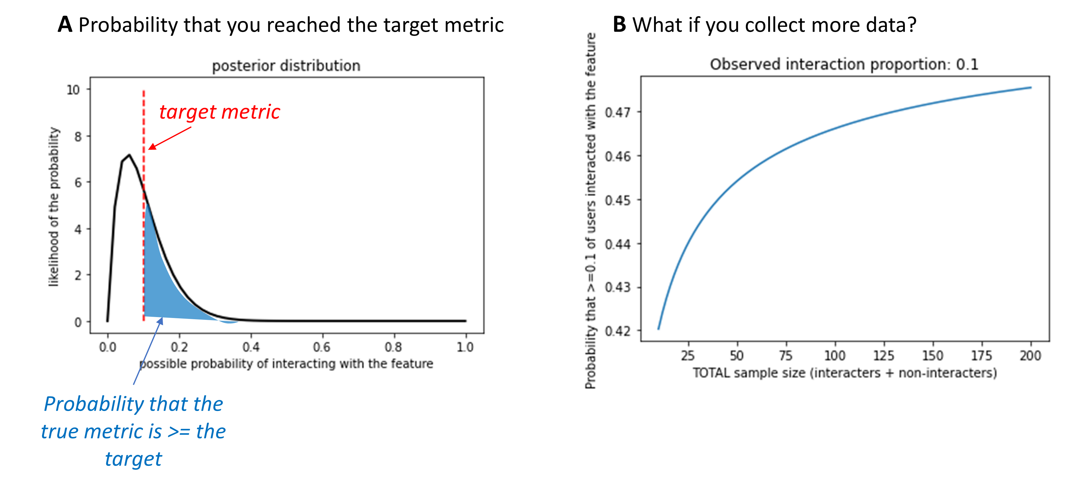
Figure 1. Example output from the metric probability calculator. In this example, a weak prior was specified (strength = 10) with a prior probability of interacting with the feature of 0.10. The target metric was (coincidentally) also set to 0.10. In other words, I would consider this feature successful if at least 10% of users interacted with it, and I weakly expected to see that. (A) Plot of the posterior distribution for this example. The posterior shows what I should believe about the proportion of users who would interact with this feature, given infinite data. The red dashed line marks my target metric (0.10). The blue shaded region indicates the area under this curve that falls above the target. This is the probability that at least 10% of users really would interact with the feature, if I had infinite data. (B) Plot of how this probability would change if more data were collected, but the observed proportion of users interacting with the feature remained constant.
How do you know what a “good” probability is? Again, there are no straightforward answers. I think of this more as information to integrate into your product development process – if your intuition says that the probability is uncomfortably low, consider gathering more data or think about ways to learn from users in a different way (e.g., user interviews). But there are no heuristics for what number corresponds with “uncomfortably low.” That’s up to you and your team, and might vary from feature to feature.
So now you have an estimate of how likely you are to truly hit your target metric – great! At this point, there’s a temptation to treat the product metric as a straightforward outcome, and make decisions – e.g., whether to invest more engineering effort in expanding the feature – based on that outcome. But, there are two problems with this approach. First, when we set the target metric, we typically follow a somewhat arbitrary process, a hand-wavy intuition. We rarely put error bars on hand-wavy intuitions, so It’s hard to know how much weight to give to a metric that falls above or below that point. Second, this calculator illustrates that the metric itself may be noisy. As a result, your “straightforward” outcome may not actually be so clear-cut.
This noisiness is also visible in Figure 1a. You might notice that, even though the observed data (1/10 users) exactly match the target proportion (0.10), the posterior distribution mostly falls below the target level. This is because, regardless of the proportion of users that you observed clicking this button, there’s still a chance that if you measured infinite users you’d find that the true proportion is slightly higher or lower. So, there’s still some uncertainty inherent to your data, even if you observe exactly the target proportion. This will likely make some people uncomfortable – uncertainty is something we’re trained to avoid. But I think that this is one of this tool’s key benefits. It makes it easier to resist the myth that the data you’ve gathered are “true.”
This brings up a natural question: if you can’t measure data from an infinite number of users, how many should you target? The calculator’s second figure provides some guidelines. Figure 1b shows an example. This plot shows the probability of hitting the target metric if you observed the same overall proportion of users acting in a certain way, but varied how much data you’d observed. In this example, I saw 1 user who had clicked on the button and 9 who hadn’t, for an observed proportion of 0.10. With that amount of data, there’s a 42% probability that at least 10% of users will click on the button (my target metric). How would this probability change if I collected data from 100 users, but continued to observe that 10% of them clicked on the button? Based on this plot, there would be about a 46.5% probability of meeting the target metric in that case. This is helpful for getting a sense for whether gathering more data would increase your confidence. In many cases, this curve will look logarithmic. At first, collecting more data increases your confidence. But eventually, collecting more data won’t increase your confidence and might not be worth the additional cost (in time, money, or your team’s patience) to collect more.
Of course, this isn’t a perfect prediction of what would happen if you gathered more data. The proportion that you observe could change as you collect more data, so there is certainly still value in observing as many users as possible. You just have to weigh the costs of waiting for more data against the benefits of having cleaner data. And I haven’t thought of a calculator yet for that.
So, how do you know whether you’ve predicted a product outcome correctly? The answer is still that you never truly know. But you can estimate how close you are to knowing. Product management, as far as I can tell, involves a lot of hedging against uncertainty with the aim of being reasonably correct, and knowing how to spot it when it turns out that you were wrong. There are a lot of tools to help you understand and meet that uncertainty, and I hope that this probability calculator becomes a useful tool in that product utility belt.