All code for these analyses is available here.
Imagine that you’re an epidemiologist who’s curious whether people who fall ill with COVID-19 differ from those who don’t along several dimensions that measure their health and demographics. Or, imagine that you’re a cognitive neuroscientist who’s curious whether a particular brain region responds differently to two types of images - for example, large and small objects. In both cases, you might want to use a classification analysis to understand whether the categories (infected vs. not infected, or big vs. small) separate out in your data. While these analyses can be quite useful, I’m often stumped by a question that comes long before I reach this point in the analysis: how much data should I collect? This post aims to find an answer.
###How does classification work? First, a bit of background. Classification analyses take data that have been collected from two or more categories and ask how easy it is to separate the data by category (big vs. small objects; people who caught COVID-19 vs. those who didn’t). This is done by drawing a high-dimensional plane to separate the categories based on the information you’ve measured about them. If a classifier can separate those categories well in held-out data, that suggests that the categories differ according to at least some of those measurements.
To make this more concrete, imagine that you have measured several kinds of demographic information for people who were and were not infected with COVID-19. Each kind of demographic information forms an axis in a high-dimensional space (e.g., if you measured 10 kinds of information, this space would be 10-dimensional: one axis for income, one for education, etc.). You can plot each patient’s demographic information in this space, as in the plots shown in Figure 1a. A classification analysis then fits a plane to separate the data of patients who developed COVID-19 from those who didn’t. You can then test this plane’s ability to separate those categories by asking how well it separates them in a separate set of held-out data (typically 20% of the full dataset). If the data from each category clusters in tight, well-separated point clouds, the classifier should be able to separate the categories in the held-out testing data pretty well. In this example, that would suggest that demographics differ between people who become infected with COVID and those who escape the disease. You could then dig in deeper to understand which demographics differ and use that information to inform public health policies that limit the rate of new infections.
How could you use these analyses to study the brain? Let’s consider a different example, schematized in Figure 1b. Imagine that you’re curious whether a region of the brain responds differently to big and small objects. For a cognitive neuroscientist, this question is meaningful because the answer tells you whether some other brain region could “read” the activity in the region that you measured, and then perform additional computations over that information (like deciding whether to try to pick the object up). That, in turn, might inform theories about how information is converted from something perceptual - like the size of an object - to an action. To investigate this question, you might measure neural responses to big and small objects using functional MRI (fMRI), a type of neuroimaging that tracks brain activity based on fluctuations in blood flow. Then, you could zero in on a specific brain region, such as the occipito-temporal cortex. FMRI data are packaged in voxels, which are 3-dimensional pixels that typically cover 1-3 mm3 of brain tissue. These voxels form the dimensions that the classifier will try to use to separate responses to big and small objects. So, if the brain region of interest contains 300 voxels, the classifier will try to discriminate responses to big and small objects within a 300-dimensional space, where each dimension corresponds to a single voxel’s responses. If it succeeds in separating the data out by object size, that suggests that this brain region responds differently to big and small objects.
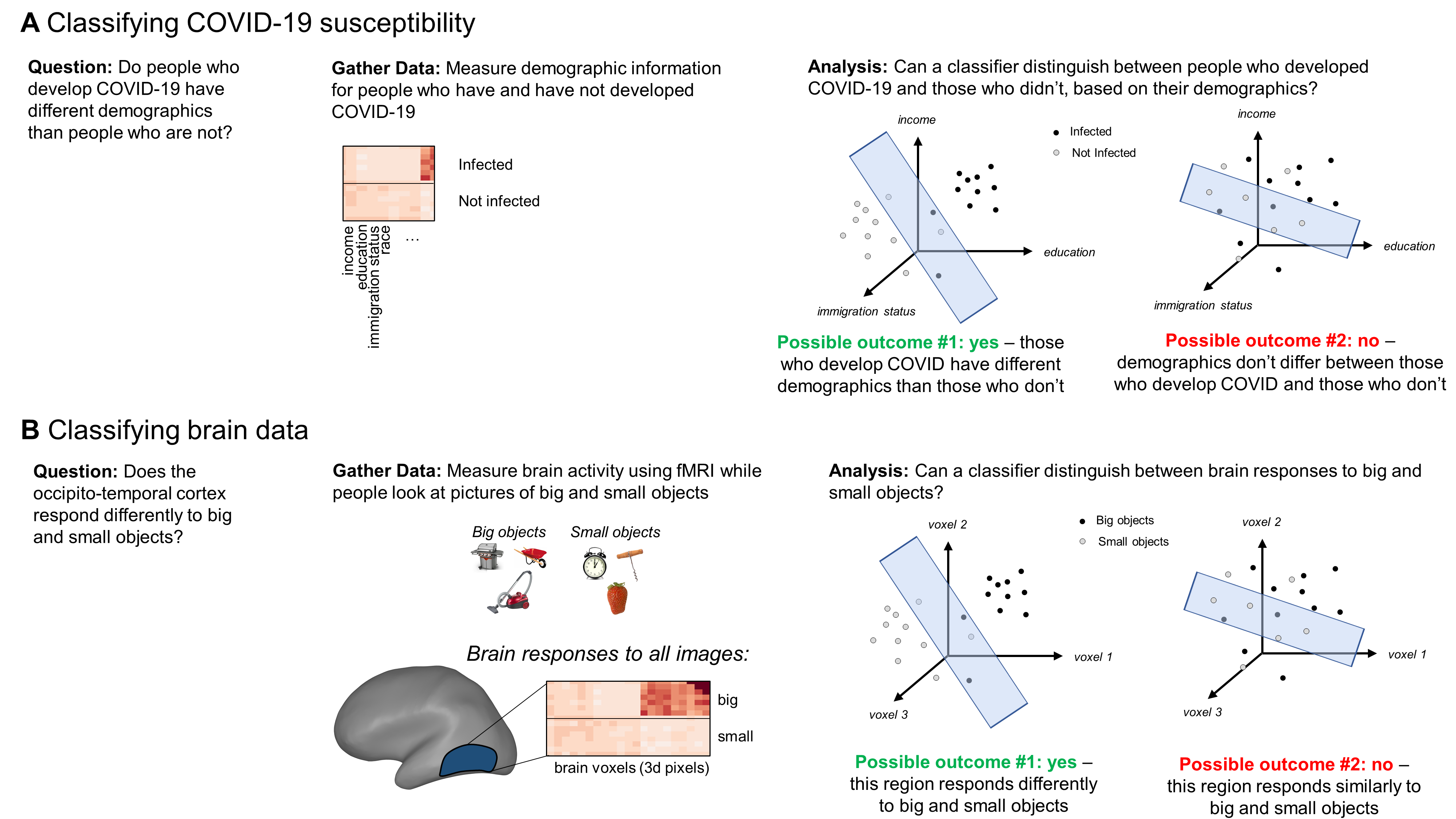
Figure 1. Examples illustrating how classification analyses can answer questions both in cognitive neuroscience and other fields.
###Aims for this post
With that background in mind, let’s turn to the main question driving this post: how much data are necessary to obtain robust classification results? In other words, how many COVID-19 patients should I gather information on, or how many small objects should I include in my experiment? When I started writing this post I was looking for a straightforward answer, like “30.” But as I dug into the analyses, I realized that such a general recommendation was unrealistic because it depends upon the real differences underlying the data, which vary depending upon the problem you’re trying to solve. So instead, my aim now is to lay out the general relationship between the amount of data you have and the robustness that you can expect in your results. Getting more data always comes with tradeoffs - in time, money, data quality, social capital, etc. I hope that this post will provide you with a useful and clear way to think through those tradeoffs so that you can make smart decisions about how to collect data and interpret the results.
###Simulations To understand this relationship between data quantity and classification quality, I turned to simulations. My basic approach was to simulate 100-dimensional data for two categories - think of this as gathering data from COVID-19 patients along 100 demographic dimensions or measuring neural responses in brain region with 100 voxels. I varied the amount of data in each category and used a classifier to ask how separable the categories were when analyzing different amounts of data. Would the classifier succeed with 10 data points per category? What about 50? I also varied how distinct the categories’ underlying distributions were. How would these patterns change if the responses to these categories were very different or relatively similar?
Specifically, I simulated responses to each category by drawing from 100-dimensional data distributions (one per category). The distance between these distributions is analogous to the “true” difference between the two categories. If the means are far apart and the standard deviations are small, the “true” difference is very large and the classification accuracy should be high. But if the means are close together and the standard deviations are large, then the “true” difference is very small, and classification accuracy might be lower (but ideally still better than chance). I measured the distance between these categories using Euclidean distance, scaled by the distributions’ standard deviations.
Once I had specified how distinct the categories “truly” were, I considered a range of possible sample sizes to draw from these distributions - from 10 to 100. At each sample size n, I randomly drew n points from each category’s distribution. Each point is analogous to one patient in the COVID-19 example or one object in the cognitive neuroscience example. Finally, I trained a classifier to separate the two categories on 80% of those data and then tested its accuracy by applying it to the remaining 20%. I followed this procedure 100 times for every n to build up a robust estimate of the classifier’s accuracy at each sample size.
Question 1: How much data do you need to detect a “true” difference?
####Case 1: A truly big difference
To start, I assumed that the categories in the data truly were very different. To simulate this situation, I randomly drew samples from two multivariate normal distributions with multivariate means of 1 and 3 and standard deviations of 1 in all dimensions. With these parameters, the Euclidean distance between these distributions (scaled by their standard deviations) was 20. Unlike popular metrics of effect size like Cohen’s d, there aren’t agreed-upon reference values for interpreting Euclidean distances. Freed from these strictures, I’ve decided that 20 is a big difference.
Then, I drew varying amounts of data from each category’s distribution and then fit a linear support vector machine to classify the difference between those data. Figure 2 shows the average classification accuracy at each sample size in blue. I’ve also included a baseline in orange: to get this, I scrambled the data’s labels (category 1 or category 2), then trained and tested a classifier on those scrambled data. The classifier shouldn’t be able to classify the categories in these scrambled data, and indeed this baseline hovers around 50%. The accuracy for intact data is similarly low when the samples are small, then climbs jaggedly toward 90% once each group contains roughly 100 data points. This performance becomes significantly better than the baseline at 10 data points per group (t(198) = 4.2, p < 0.001), but that pattern fluctuates and isn’t robust until around 15 data points per group.
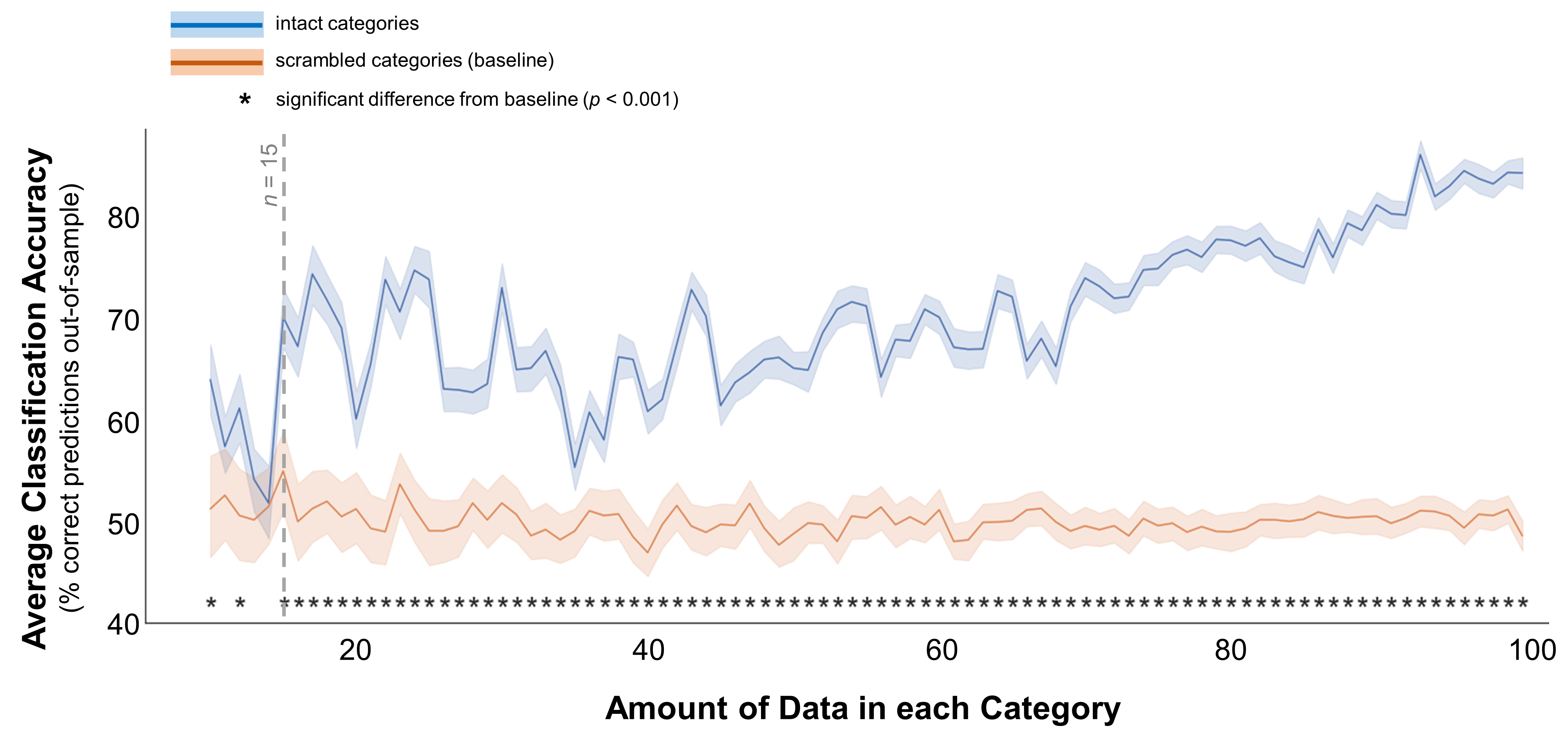
Figure 2. Classification accuracy for well-separated categories. In these data, the multivariate mean values for the 2 simulated distributions were 1 and 3. The standard deviations for both distributions were 1 for all dimensions (e.g., demographic dimensions or brain voxels). Average classification accuracy is plotted for simulated data from two distinct distributions in blue. Accuracy is also plotted for a scrambled baseline in orange. Margins indicate 95% confidence intervals around the mean. Asterisks indicate cases where classification accuracy was significantly better than the scrambled baseline (independent-samples t-test, p < 0.001). Grey dotted line indicates the minimum recommended amount of data per category, based on this plot.
These results suggest that if the categories truly are different - patients with and without COVID-19 have very different demographics, or a brain region responds very differently to big and small objects - you need at least 15 data points per category to pick up on that difference.
But of course, often the categories don’t separate out so cleanly. So, what if your assumptions are a bit less quixotic and you expect that the categories are a bit more similar?
####Case 2: A truly moderate difference To simulate categories that are a bit harder to separate, I followed the same procedure but changed the means of the multi-variate distributions: now they were centered at 1 and 2, rather than 1 and 3 (scaled Euclidean distance = 10, rather than 20). Figure 3 shows the results of classifying these categories at different sample sizes. This time, the pattern is a little less clear. The first sample size where classification accuracy is significantly better than the baseline is 15 (t(198) = 5.4, p < 0.001). However, the accuracy curve is even more jagged than in the “big difference” case, and accuracy isn’t robustly better than the baseline until a sample size of roughly 50.
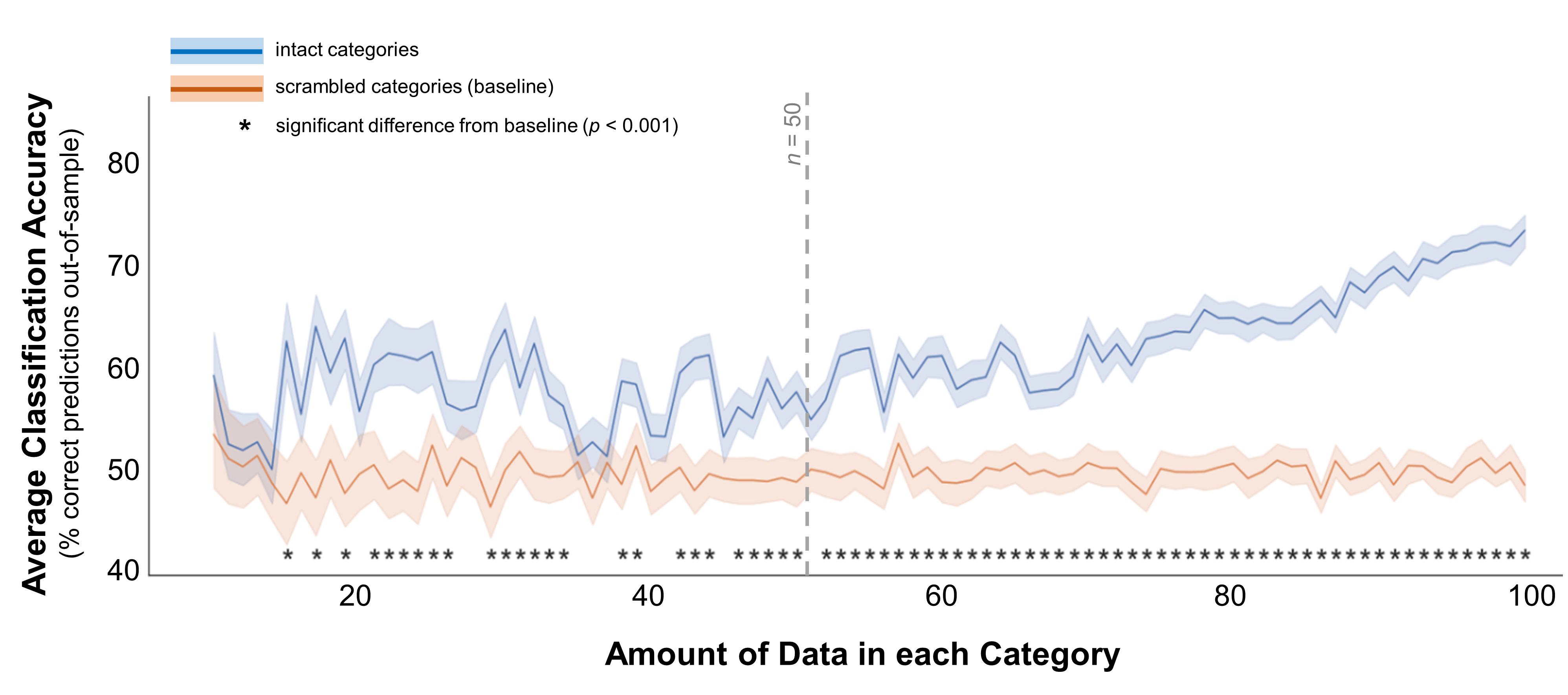
Figure 3. Classification accuracy for moderately-separated categories. In these data, the multivariate mean values for the 2 simulated distributions were 1 and 2. The standard deviations for both distributions were 1 for all dimensions (e.g., demographic dimensions or brain voxels). Average classification accuracy is plotted for simulated data from two distinct distributions in blue. Accuracy is also plotted for a scrambled baseline in orange. Margins indicate 95% confidence intervals around the mean. Asterisks indicate cases where classification accuracy was significantly better than the scrambled baseline (independent-samples t-test, p < 0.001). Grey dotted line indicates the minimum recommended amount of data per category, based on this plot.
These results suggest that, if the categories are moderately different, you need at least 15 samples per category to pick up on that difference - but 40-50 would be safer.
####Case 3: A truly small difference
To continue down this path, what if the categories really do differ, but only very weakly? To simulate this situation, I moved the two distributions even closer together: their means were 1 and 1.5 (Euclidean distance = 5). You might notice that the difference between the “small” and “medium” distances I used here is half the difference between the “medium” and “large” distances - they aren’t scaled linearly. But these are just meant as snapshots of different kinds of data, and I’ll discuss a smoother continuum later in this post. Figure 4 shows the resulting classification accuracy across sample sizes. As you’d expect, with such a small difference in the mean measurements the classification accuracy doesn’t climb above baseline until a sample size of 45 (t(198) = 4.2, p < 0.001), and it isn’t robustly different from baseline until around 70. These results suggest that you shouldn’t expect to pick up on a small but true difference between two categories with less than 70 samples per category.
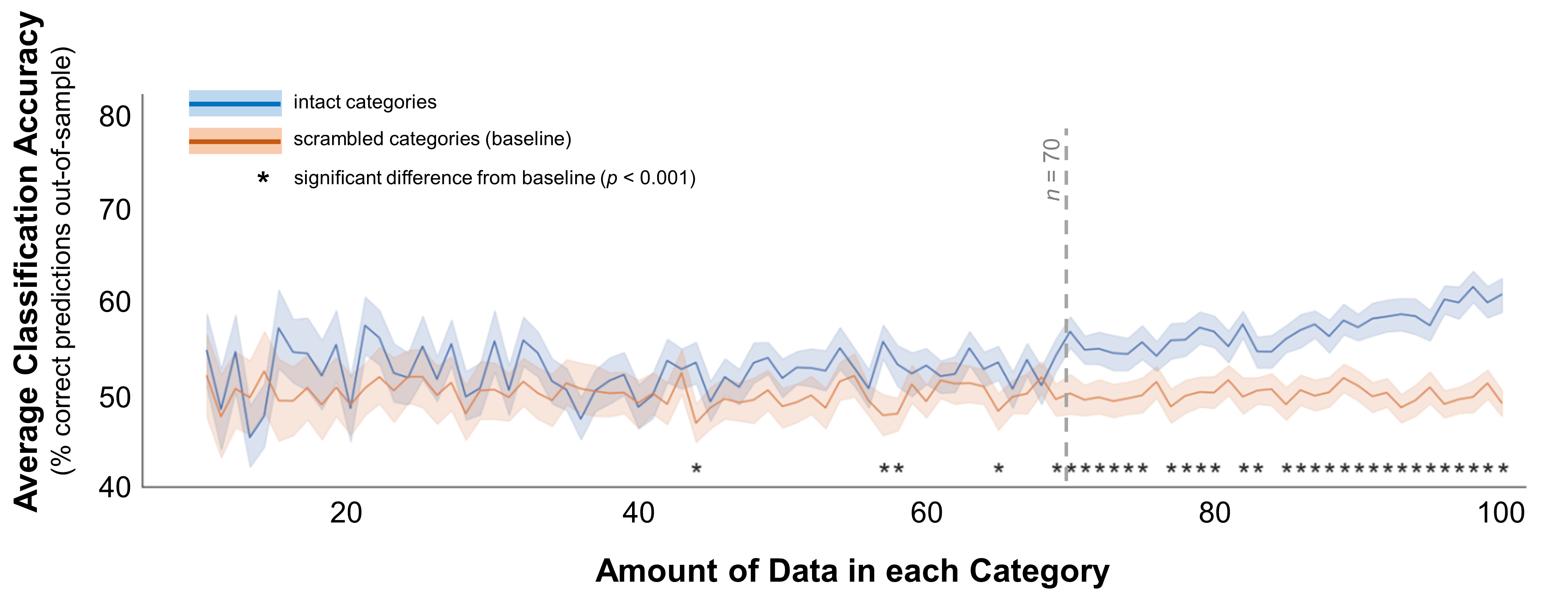
Figure 4. Classification accuracy for categories separated by a small gap. In these data, the multivariate mean values for the 2 simulated distributions were 1 and 2. The standard deviations for both distributions were 1 for all dimensions (e.g., demographic dimensions or brain voxels). Average classification accuracy is plotted for simulated data from two distinct distributions in blue. Accuracy is also plotted for a scrambled baseline in orange. Margins indicate 95% confidence intervals around the mean. Asterisks indicate cases where classification accuracy was significantly better than the scrambled baseline (independent-samples t-test, p < 0.001). Grey dotted line indicates the minimum recommended amount of data per category, based on this plot.
###Question 2: How much data do you need to reject a “false” difference?
So far, I’ve explored the question of how much data you need to separate two groups that are truly different. This is roughly analogous to asking, “how much data do I need to avoid a Type II error (failing to find an effect when there is one)?” We can use the same approach to examine how sample size might affect Type I errors (finding an effect when there isn’t one).
To do this, I used the same simulation approach, but this time I drew data for both categories from the same distribution. This means that there will be some variability in the exact values drawn for each categories’ data points, but it shouldn’t be possible to distinguish between them. Thus, any finding that a classifier does distinguish between the categories is spurious. Figure 5 shows the results of this analysis.
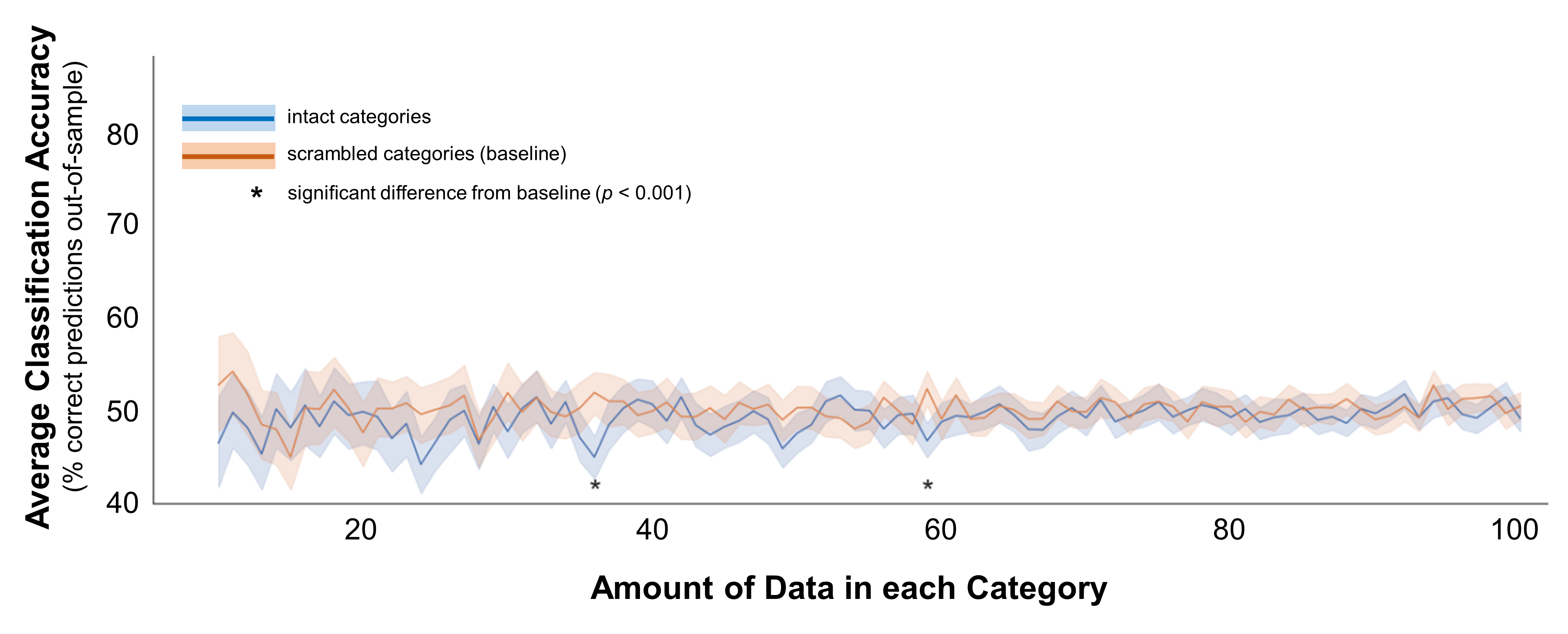
Figure 5. Classification accuracy for categories that do not differ. In these data, the data for both categories were drawn from the same distribution (multivariate mean = 1, multivariate standard deviations = 1). Average classification accuracy is plotted for simulated data from two distinct distributions in blue. Accuracy is also plotted for a scrambled baseline in orange. Margins indicate 95% confidence intervals around the mean. Asterisks indicate cases where classification accuracy was significantly different than the scrambled baseline (independent-samples t-test, p < 0.001; note that in all cases marked here, accuracy was significantly worse than baseline).
On average, classification accuracy was at or even below baseline no matter the sample size. But the phrase on average is key here, and it doesn’t tell the whole story. It makes sense that there would be no difference in the data on average, because at every sample size I drew 100 random samples. By chance, the classifier might do troublingly well in some of these samples - you might find a classifier with 70% accuracy when it should be 50%. But, it works both ways: you might also find a classifier with 30% accuracy. This variance is what makes false positives a danger when classifying small amounts of data - your data are more likely to separate out troublingly-well by mere chance. So, to understand how the risk of false positives changes as you increase the data, it’s important to consider the range of possible outcomes, and ask how well you could classify in a random sample.
Combrisson & Jerbi made this point in their 2015 paper, which investigated a similar question in EEG and MEG data (electro-encephalography and magneto-encephalography, two methods for tracking how brain activity changes over time). Using a similar simulation-based approach, the authors generated random data from the same distribution and assigned it into two categories that each contained 12-250 data points. Then, they tried to classify the categories. With small sample sized (N = 12-50), they found that classification accuracy reached 60-70% in extreme cases (Figure 6a). These extreme cases were less common in larger samples, where the variance in classification accuracy was much lower.
In my simulated data, I also found that the classifier’s performance was more variable in small sample sizes. Figure 6b plots that variance for each sample size. The standard deviation was as high as 25% in the smallest sample sizes, then dropped down to around 10% with at least 40 data points per category. This point seems to mark an elbow in the plot - in samples over 40, analyzing more data only marginally reduces the variance in the classifier. This elbow suggests that it’s best to include at least 40 data points per category to avoid a false positive result.
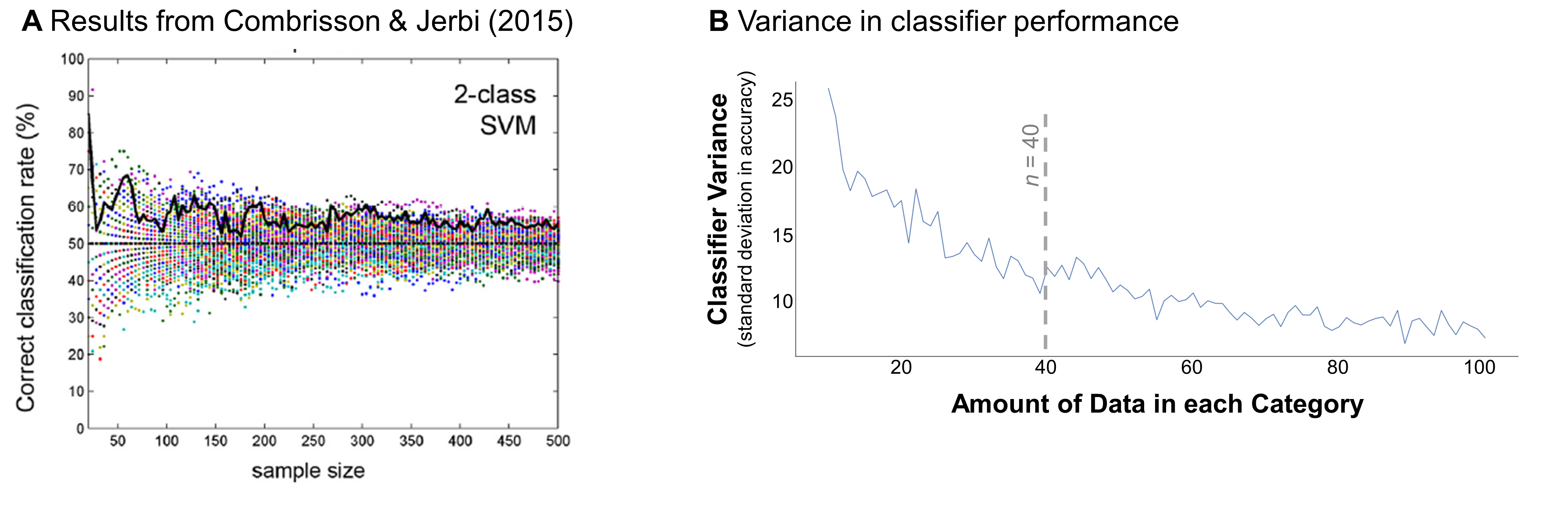
Figure 6. Possible false positives across sample sizes. (A) Example result from Combrisson & Jerbi (2015), showing classification accuracy as a function of sample size when discriminating between data drawn from the same distribution. Sample size was measured across the two categories (e.g., a sample size of 50 indicates that 25 samples were drawn for each category). Colored dots indicate the results for 100 different iterations of the analysis. Bold black line highlights an example iteration. (B) Variance in simulated classifier performance in my analyses, based on the results shown in Figure 5. Variance was calculated for each sample size as the standard deviation in the classifier’s out-of-sample prediction accuracy. Dotted gray line indicates this curve’s approximate “elbow” (where results become less variable).
###From theory to action
I hope that these simulations give you a sense of the relationship between how much data you have and how robust your results are likely to be. I think it’s particularly helpful to look at the shape of the curves in Figures 2-5, which illustrate how beneficial it actually is to collect more data, depending upon the real difference between your categories (more on that soon). If the curve slopes steeply up from the amount of data you would normally collect, then collecting a bit more data will probably be valuable. But if the slope is very gradual, it might not be worth the extra expense.
How can you translate these curves into a concrete plan? Here are some more specific guidelines for what to think about before and after collecting your data.
####Before collecting data To decide how much data to aim for, it’s important to figure out how large of a difference you’re looking for. This “effect size” could be how different you suspect the categories really are. In that case, you can generate an estimate based on the literature, an educated guess, or pilot experiments. Alternatively, you could consider what is the smallest difference you would consider to be “real” or satisfying if you found it in your data. You could also arrive at this by looking at the literature - think about a difference that you think is large and real based on the literature (e.g., responses to faces vs. scenes in a brain region specialized for face processing) and dig into some data to calculate the Euclidean distances between categories in that case. Regardless of your approach, I encourage you to “pre-register” this estimate, if only with yourself.
Once you’ve estimated the size of the effect you’re looking for, check out Figure 7 to get a ballpark for how much data you need to collect to detect this effect, in an ideal world. This figure plots the suggested minimum amount of data per category for a range of effect sizes, based on my simulations. These simulations suggest that when the categories don’t differ by much (a small effect), it’s necessary to test a very large amount of data - at least 100 observations per category. But when they differ more, it’s probably sufficient to test less data: for example, you could reasonably analyze 50 observations per category if the distance between categories is around 10, or 15 per category if the distance is around 20. But, keep in mind that my simulations also indicate that you should include at least 40 observations per category to mitigate the risk of a false positive result - so, this may be a good lower bound even when you’re chasing a very large effect.
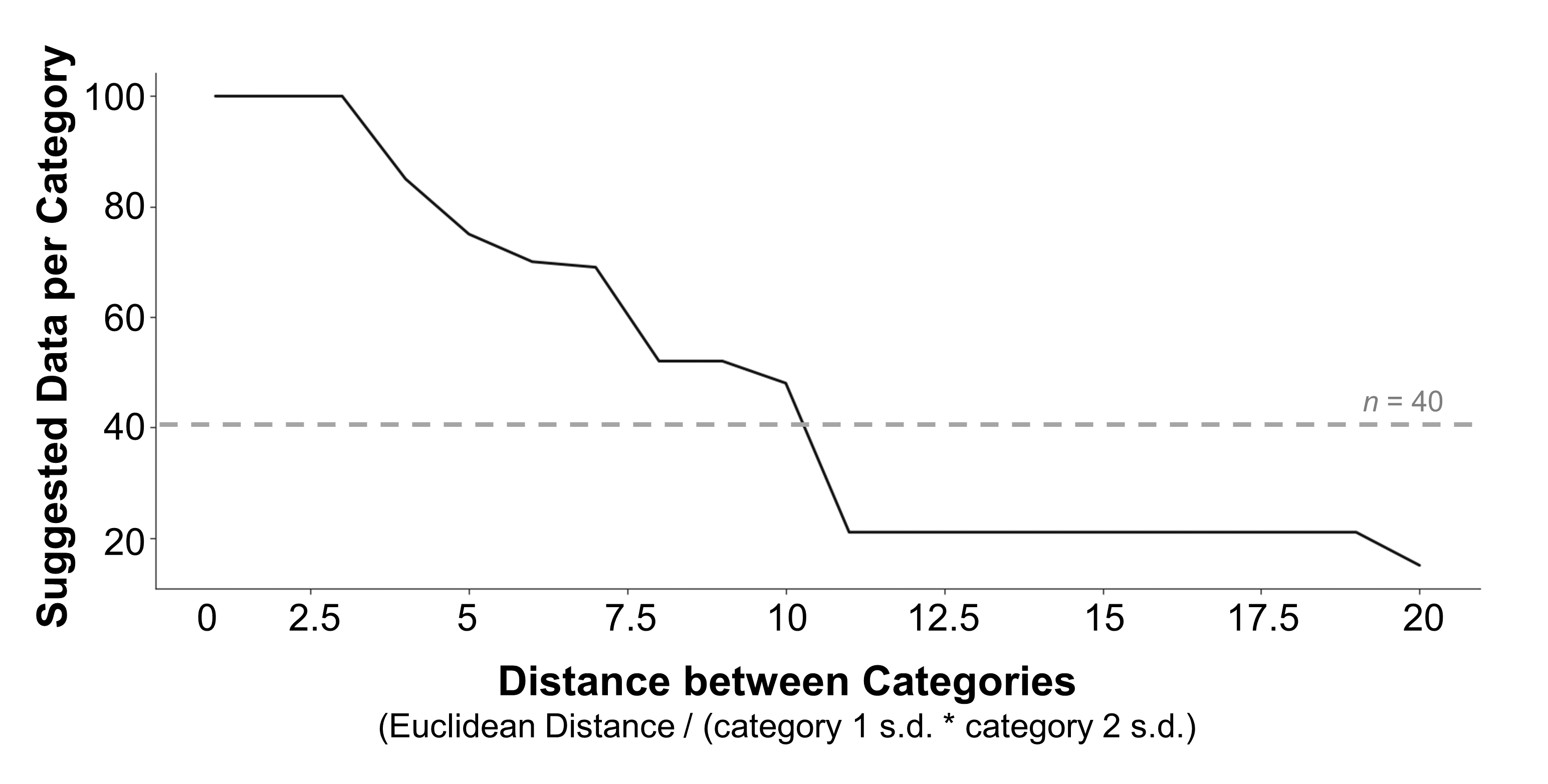
Figure 7. Data collection guidelines. A suggestion for how much data to collect per category is plotted for a range of possible effect sizes. Suggestions are based on the smallest amount of data where the classifier detected a real difference in the data and performed significantly better than a scrambled baseline. To ensure that these suggestions weren’t erratic (e.g., see Figure 4 for cases where a small sample size was significant but larger sample sizes were not), I imposed the additional criterion that these values were part of a run of at least 5 sample sizes in a row that were all significant. If no sample sizes met these criteria, the suggestion defaulted to 100 samples per category. The effect size of the difference between categories was calculated as the Euclidean distance between the two multivariate distributions, divided by the product of their standard deviations. Grey dashed line marks the point where the possibility of a false positive result begins to drop (see Figure 6b).
If this ideal ballpark is larger than seems realistic to you, use the curves in Figures 2-5 (or adapt my code and make your own) to visualize the tradeoffs more explicitly - this will help you see whether collecting slightly more or less data will dramatically affect the robustness of your results.
####After collecting data
These curves are also helpful after you’ve collected your data, run your analyses, and are interpreting their results. Say your classifier didn’t find a difference in your data, but you also didn’t have as much data as would be ideal. In this case, you can’t really conclude that your categories don’t differ. You can only conclude that you were unable to detect a difference in your data. However, it’s possible that you probably could have detected a large or medium-sized difference if it existed. If you can figure out how large of a difference you did have the power to detect (based on Figure 7), you can at least rule out the possibility that the data differed by that amount or more.
###Going Forward
There are a lot of nuances to answering the question that I set out to address - “how much data do you need to run a classification analysis?” But pushing that nuance aside, I take two main points away from this analysis. First, if you’re planning a classification analysis, err on the side of collecting as much data as you pragmatically can (keeping in mind that fMRI data in particular are very expensive and hard to acquire). Second, pre-register your expectations of how different you think your categories might be, at least with yourself. Doing so will help you decide how much data to collect, and to interpret your results with the appropriate amount of caution.
This may not be the straightforward answer I hoped for, but I do think that I’ve gained a bit more clarity on how to plan my analyses going forward. Hopefully more and more researchers will dive into these questions, and update my simple analysis with more data, more perspectives, and more practical considerations!
###Appendix: fMRI-specific considerations
Although classification analyses can be in a wide variety of settings, I’ve come across several considerations that are specific to analyzing brain data.
One thing to note is that I made a couple of simplifying assumptions here that might not hold in real fMRI data. First, I assumed that the standard deviations of the two distributions were always equal to each other, and were equivalent in all dimensions (voxels). In reality, some categories or voxels might be noisier than others, and thus would have different standard deviations. Second, I assumed that the 100 simulated voxels were independent - voxel #1’s responses were totally uncorrelated with voxel #99’s responses. In reality, this independence is also unlikely. Because many of the voxels in a functional brain region respond similarly, and because spatial smoothing is a standard step during pre-processing, some of the voxels in a real brain region are likely to correlate. However, figuring out a reasonable covariance structure between these simulated voxels is beyond the scope of this analysis.
Beyond this covariance structure, it’s also important to consider what data, and how much data, go into each point in your categories. In the example illustrated here, I assumed that each data point corresponded to a single image (like scissors or a mug). But there are actually several alternative approaches beyond this one. One alternative is to measure responses to repeated presentations of the same items - each point would correspond to an instance when the subject saw a mug or scissors. Often, researchers combine these approaches, measuring responses to a variety of items, presented multiple times - each cloud contains r*i points, where r is the number of times a single item is presented and i is the number of items in the category. You could also combine data from different subjects - each point would represent a single subject’s response to a single image.
In addition, researchers vary in the granularity of their measurements: one data point could represent the response to a single repetition of a single item (which can be noisy), to a single item averaged across repetitions (less noisy), or to a single block of items that were presented in sequence (least noisy). Note that there are real tradeoffs between power and sample size here - if you estimate responses separately for each repetition of an item, you will have more points in your point cloud than if you estimate responses across multiple runs. But, that cloud might have a larger spread because the repetitions are more variable. Although it’s important to think hard about how to measure each point in your data, exploring the consequences of these different methods is beyond the scope of this blog post.
Finally, it’s possible that the relationships I’ve outlined above would change with regions of different sizes - yet another toggle to consider!