Here’s something that I can’t unlearn after years of statistical training: when you’re comparing samples of data along some metric, it’s not sufficient to report their averages. You also need to report how much your data varies around those averages. Without information about variability, you might misinterpret your data’s overall patterns. This makes it particularly important to visually mark variability on the plots that we use to communicate findings in a memorable way — for example, with error bars. But, outside of academic papers, we rarely do this, and it drives me kind of crazy.
Why variability matters
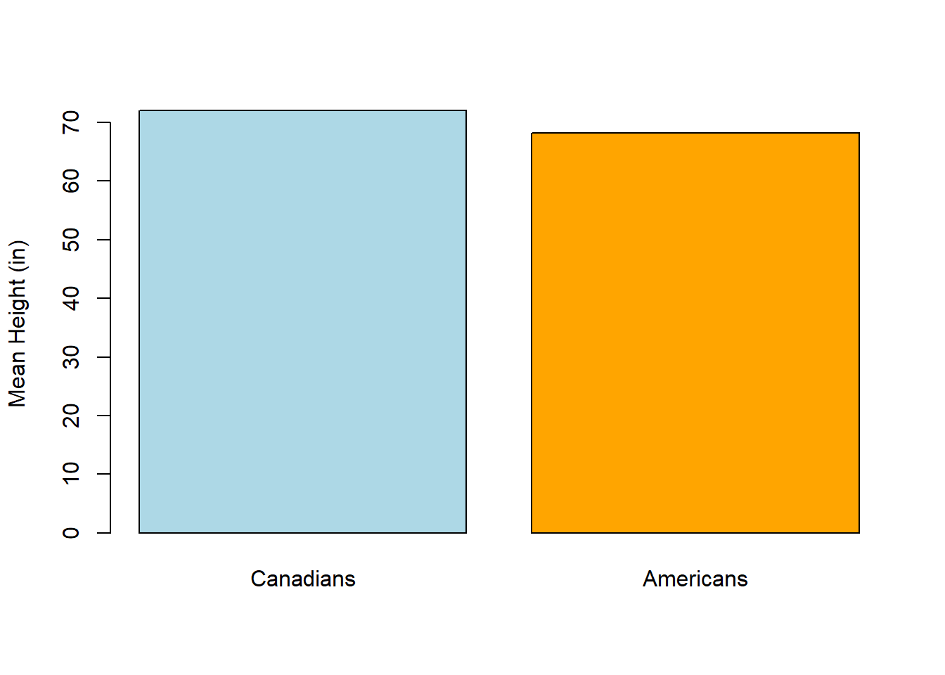
Let’s back up a second. Say you want to know whether Americans or Canadians are taller. So, you collect height data from a sample of 100 Americans and 100 Canadians. How do you know which group is taller? A common approach is to calculate the average height (in this case, “average” means “mean”) for each group. Then you compare these averages – if the Canadian average is 6 feet and the American average is 5’8”, that suggests that perhaps Canadians in general are taller than Americans.
Because it’s good to visualize your data, you might also make a graph, like this:
 This seems reasonable, except that the averages are only part of the story. Your data’s variability also constrains what conclusions you can draw from your results. “Variability” isn’t a technical term; I’m using it to broadly capture the spread of your data, which affects your certainty that its averages are a good summary of its trends. Your data might have a high variability because individuals within your sample really do differ from each other, or because of measurement or sample error.
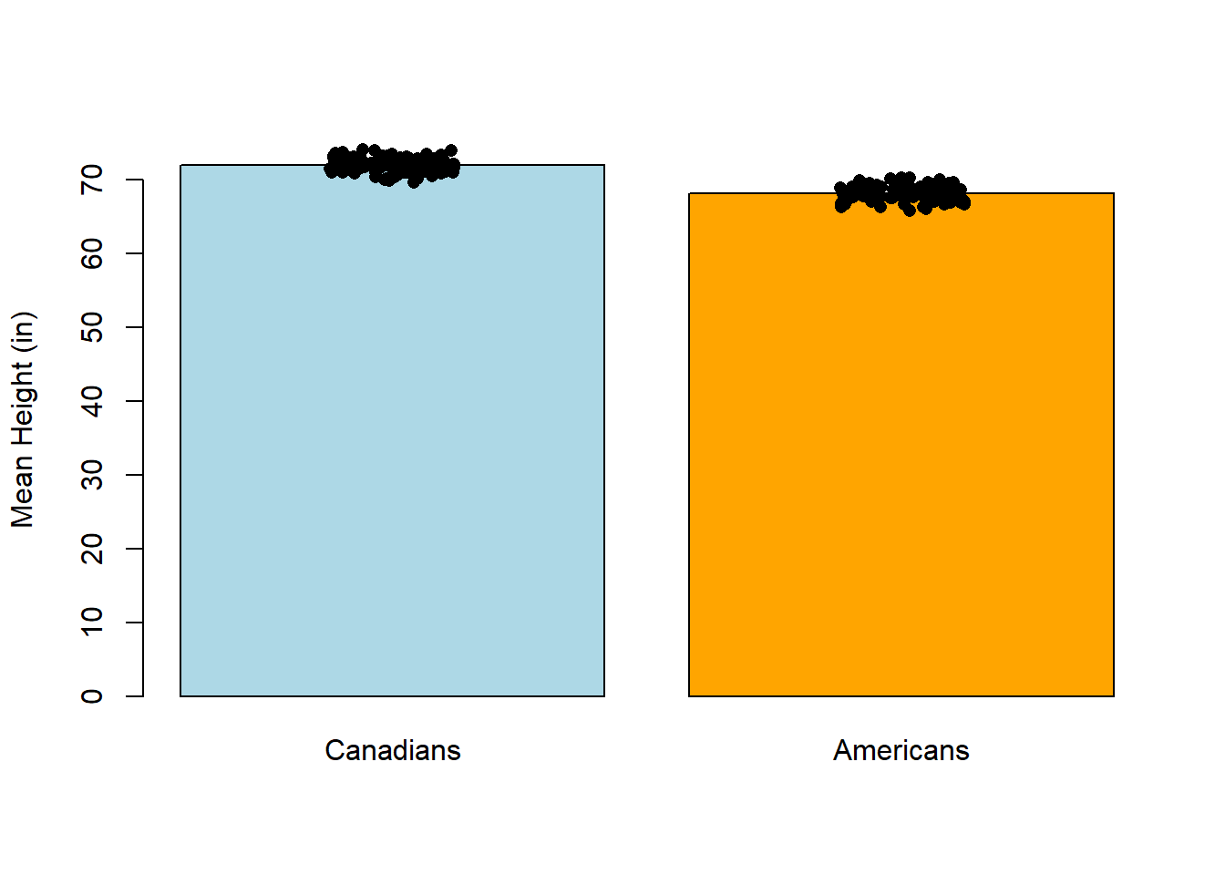
Say the average height for the Americans in your sample was 68 inches (5’8”). If most of the people in your sample were essentially the same height – perhaps 95/100 people were between 5’7” and 5’9” – the variability for that sample is low. If that’s also true for the Canadians, even a small difference between average heights could be real.
To make this more concrete, I’ve added one point per person to the plot below. You can see that the data is all pretty tightly clustered around the means, so it seems reasonable to compare the groups by simple comparing their averages.
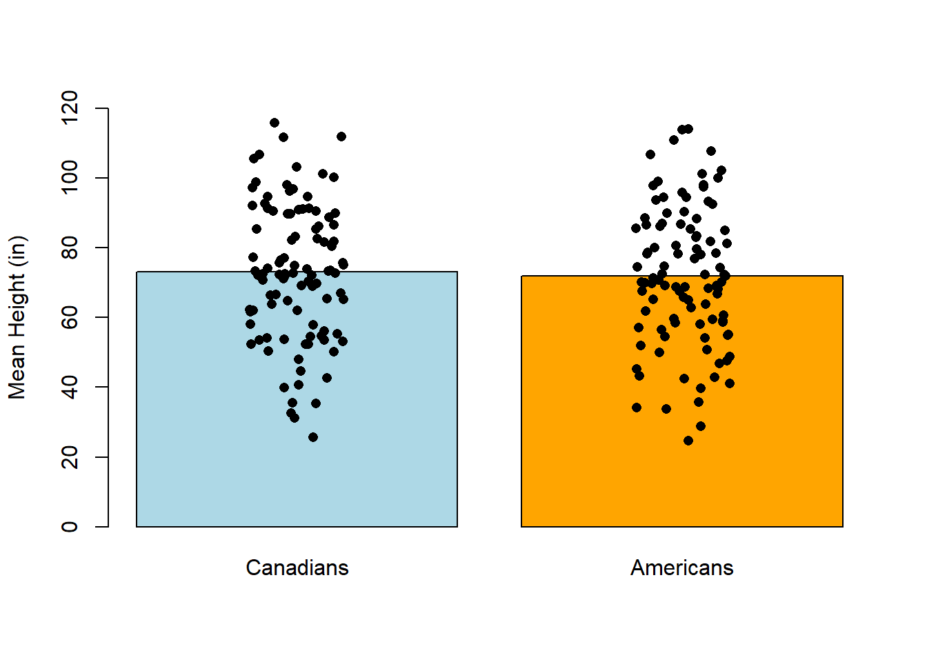
 In contrast, imagine the opposite scenario: many of the Americans in your sample are much shorter or taller than 5’8”, and many Canadians are much shorter or taller than 6’. In this case, the variability is high and a small difference between the average American and Canadian heights might just be noise. In other words, the 4” difference in between the average American and the average Canadian might be very small compared to the average difference between one American and another.
Essentially, the same difference between two averages could be real or merely noise, depending upon your data’s variability.
How to measure variability
Several statistics can be used to capture specific facets of variability:
- Standard deviation: the square root of the average difference between each observation and the mean.
- Variance: the standard deviation squared
- Standard Error of the Mean: the standard deviation divided by the square root of the sample size
How to plot variability
One way to include variability on standard bar plots is to add error bars. Error bars are vertical lines that are centered at the mean value (generally the top of a given bar) and extend in both directions based on how variable the data are. They’re typically superimposed on a plot, and they can be used for other kinds of plots as well (such as a time series or a scatter plot).
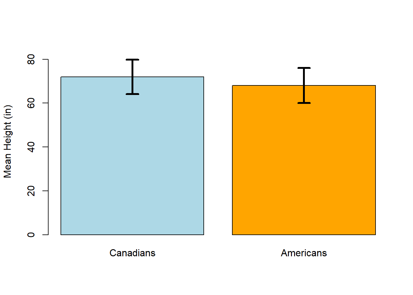
I favor plotting the standard error of the mean (SEM) with error bars: the error bars extend from (mean + SEM) to (mean - SEM). For example, if we were to re-plot the Canadian-American height comparison with error bars, it would look like this if the data had low variability:
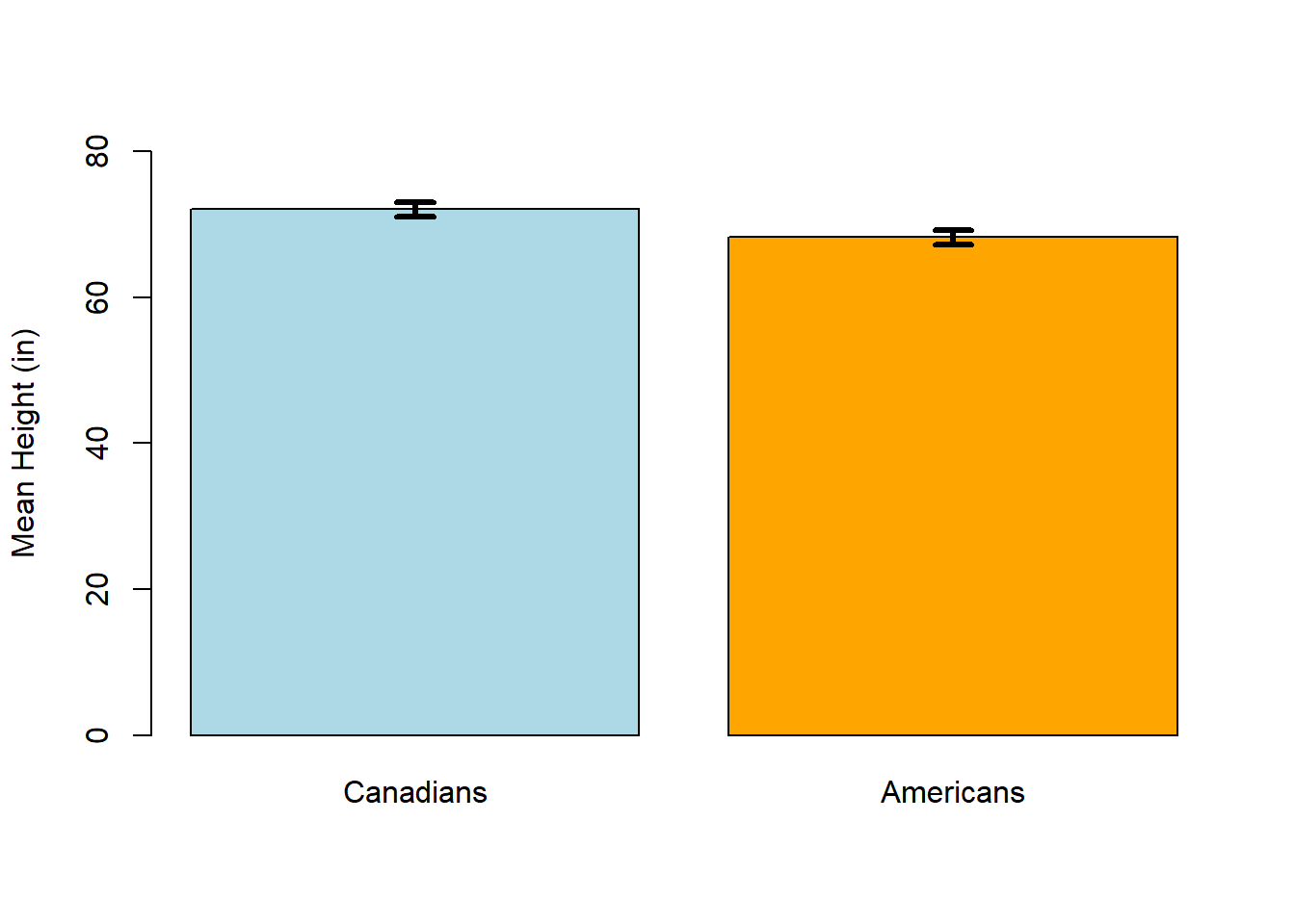 The error bars are both very narrow and they don’t really overlap – not many Canadians are the same height as Americans.
However, the plot might look like this if the data had a higher variability:
In this case, the error bars are much wider, and they overlap – a lot of Canadians and Americans are the same height. In general, if the error bars overlap I want to take a closer look at the data, because that might indicate that an apparent difference between means isn’t real. And if the error bars are wide, I wonder about the quality of the data (for example, does the sample size seem sufficient? Is there reason to suspect that the measurements are imprecise?).
Should you even use bar plots?
If you’re already familiar with statistical visualizations, you might be wondering why I’m even bothering to tell you to make bar plots of any kind. Surely it’s better to show people the full distribution of the data, for example with the violin plot. To which I say: yes, I agree – mostly. I still think that bar plots can be useful, especially when visualizing data without variability (e.g., counts), but violin plots and overlaid histograms often tell a fuller story about the data. But also, we live in a society that continues to use pie charts in spite of their shortcomings, so, baby steps.